ツバクロすっぽん食堂 | すっぽん料理専門店 (2015)
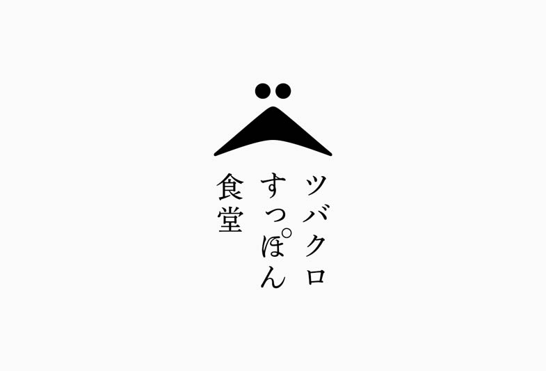


Branding and production for the Osaka branch of this ‘suppon’ (soft‐shelled turtle) specialty restaurant. The branch in Kyoto is already a popular place to enjoy the suppon dish at a reasonable price. The logo mark expresses the face of soft-shelled turtle when you see it from the front. Renovating a space, stocking from the goodwill of others, and having limited budget eventually made the restaurant more “casual” dining experience which we think it was the perfect outcome of this project at the end of the day.
すっぽん料理専門店のトータルディレクション。京都で気軽にすっぽん料理が楽しめると人気のお店の大阪店。二羽のツバメと正面から見たすっぽんの顔を表したシンボルマーク。居抜き店舗を活用しローコストでの出店という条件が「気軽さ」や「敷居の低さ」を表現するにはちょうど良かったように思う。
creative direction : Yuki Hisada
interior design : Shinji Daiku / Ninth
graphic design : Nanako Oya


